New packaging for DIXI
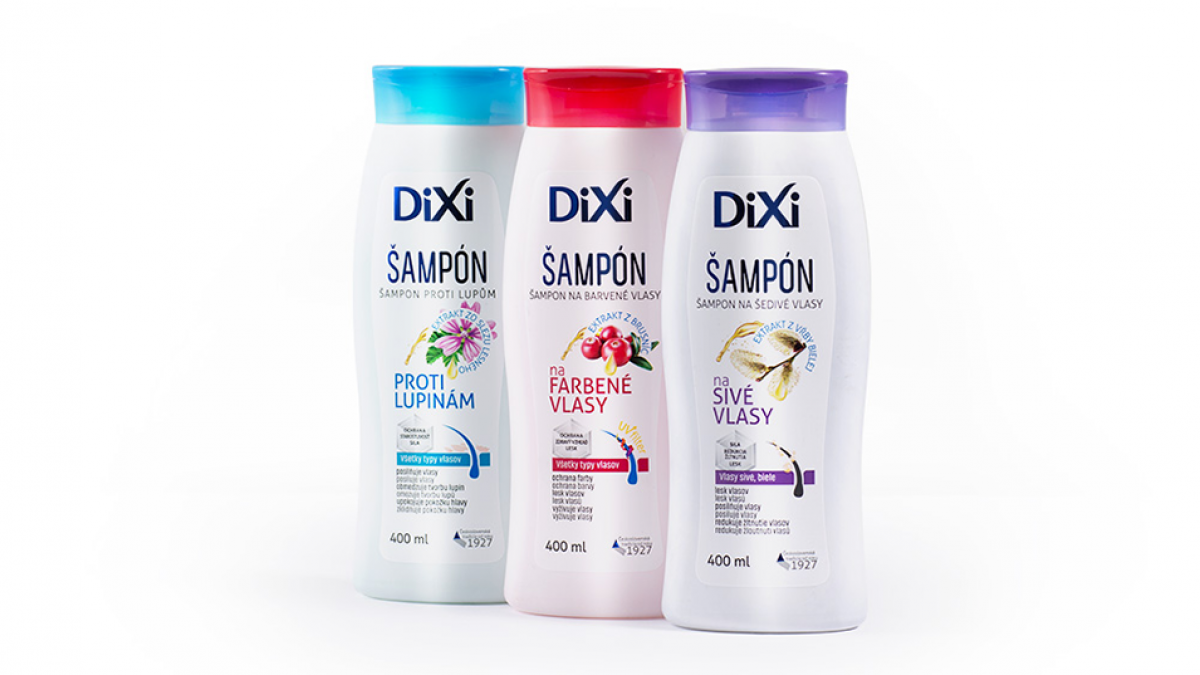
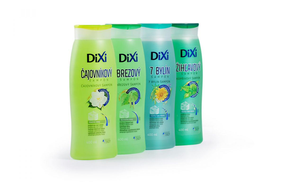
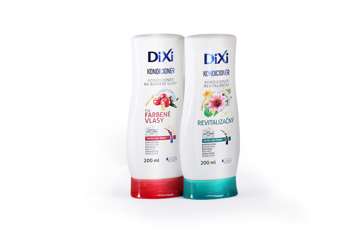
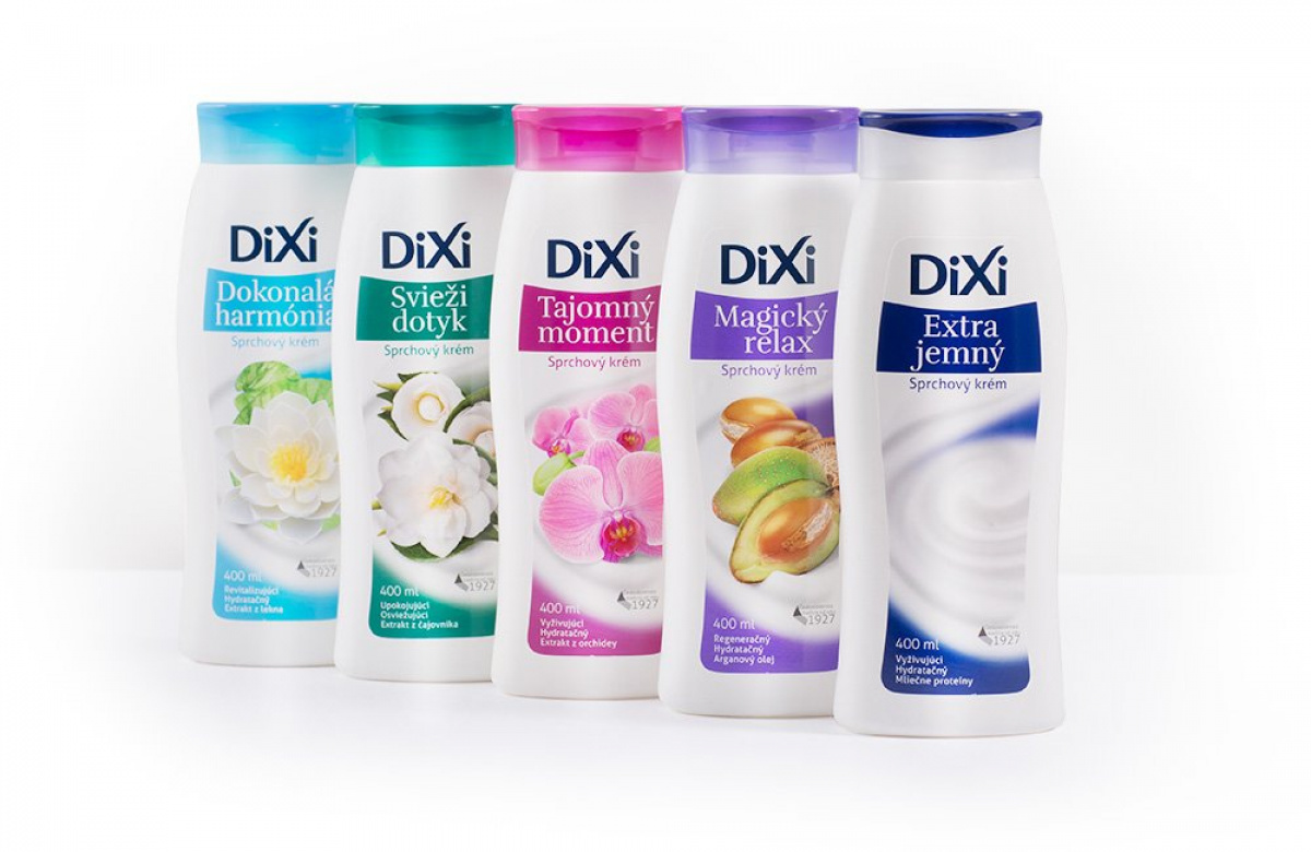
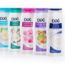
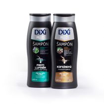
We have been working with Herba Drug for a few years now as their agency of choice for packaging design. We have recently extended our cooperation to include marketing and prepared a campaign for Dixi, which introduced new packaging and reminded consumers of this brand.
Right at the beginning, it was necessary to redesign the Dixi logo. A more robust shape and more room for the logo are always a good foundation for building a new brand image. After lengthy deliberation and tests, a decision was made to rearrange the logo using a fresh metallic blue colour.
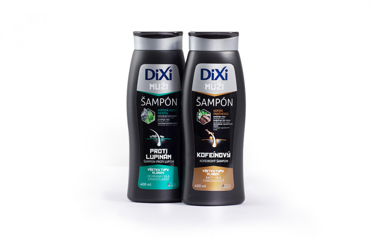
The goal of the packaging redesign was to appeal to the new generation without losing the older one. Instead of an ultra-modern redesign, we gently evolved the original one, preserving the key identifying features. What helped us to do this was the fact that the packaging resembles the original one in its shape and colour.
This was followed by further creative processes of designing the packaging of the individual products – men’s, women’s and unisex. The overall result should be clear and contemporary while preserving styled retro elements to appeal to the mainstream customer.
We are gradually continuing with the redesign of other products to keep the product line compact. We hope our new styling will deliver success for the Dixi brand and are pleased to see that the initial news confirms this.
Fingers crossed, Dixi!
